From Final Drafts to Final Pieces.

Front cover.

  • The major difference between the two is the difference in colour of the masthead. Having a purple masthead meant it blended in too much with the cover lines and the cover image, not promoting the brand logo enough.
  • The headline font was also changed because previously it was the same font as the coverless and so it didn’t stand out.

Contents Page.

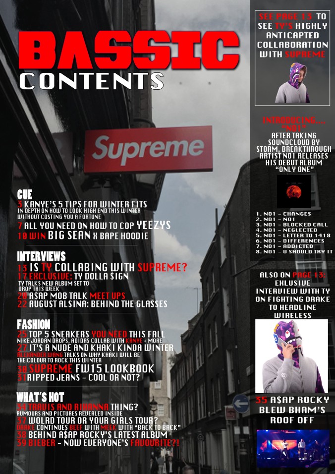
  • The right column on the final draft was a good idea but it didn’t look appropriate as there was a poor choice of font and the wording of how I was promoting my artist wasn’t clear. In the final piece that was all changed.
  • The layout of the ‘contents’ letters previously didn’t suit the style of contents page I was going for, I realised it suited some magazines but not mine, and so I went for something that killed more space.


Article Page.

  • The biggest difference is the article page. Previously, the headline was too ‘box-like’ and amateur and didn’t look like it belonged.
  • The article also just looked placed randomly and the white box just added to the amateur feel. The text writing was also too large.
  • The graphic was a good idea however there was no photo of m artist’s face and so this left the article almost without a face, suppressing the meaning and platform.
  • The final piece was a complete remap, I added a photo of Ty, giving my article a voice and also got rid of the white box.
  • I added a banner at the top of the page to promote the brand image and included a big logo behind the graphic to give the page layers and authenticity.
  • Finally I also realised the big block of text looked uninviting, and so I embedded a quote and the photo in between paragraphs in order to look more appealing.

Evaluation Questions 4 and 5.

Q4/5. Who are your target audience and how did you attract and address them?

The typical person buying my magazine would be male and between the ages of 16-24, females would also be enticed to buy my magazine because of the aspiring fashion aspects but a majority would be males. The lyrics in the songs would entice boys becScreen shot 2016-02-29 at 13.04.39ause women are perceived as objects and rappers are constantly bragging about how many girls they have.

Young males aspire to be able to have all these girls and expensive garments; clothes, jewellery and cars and so my magazine will interest them in the aspect that they will be exclusively see what the rappers say themselves. This is part of how exclusive magazines are, as not everyone gets to ask celebrities real life questions, however my magazine it is full of interviews of stars who will intrigue young people.

Archetypal reader:Screen shot 2016-02-29 at 13.04.52

  • This is Kai, Kai is the type of person I would expect to be buying my magazine – he is 19 and works part time at JD.
  • His favourite artists are Big Sean Kanye West and A$AP Rocky, he went to see Rocky live last year in Birmingham and hopes to see both Rocky and Big Sean at wireless festival in the summer this year.
  • Kai uses social media a lot and so follows all the artists and some of their friends such as Ian Connor on twitter so he can keep up to date with what they’re doing with their lives.

    Screen shot 2016-02-29 at 13.05.01

Pictured right: (Ian Connor with A$AP Rocky).

Pictured below: (Ian Connor with Kanye West).

Screen shot 2016-02-29 at 13.05.15

How I engaged my potential reader:

Bape being used as the clothing on the front cover excites my audience and they know that is a very hyped brand which can be hard to get ahold of as it is made in small quantities and sold at high prices, making it very valuable and prestige – This signifies what my magazine is, a very wanted and collectable music magazine that is full of the most wanted things in the industry (hottest clothes, girls, jewellery).

FINAL MAGAZINE COVER.jpg
Big names have been used in the cover lines as they have a large fan base, this enables me to connect with as wider audience as possible. Travis Scott and Rihanna had rumors speculating them which was highly anticipated and so I made them both the same colour and so people can recognize that I’m talking about the two’s situation.

On the contents page I have included a free album for an upcoming artist, this both promotes young artists but also readers who want a shout out are available to be featured in the magazine. This motivates readers to pursue their careers but is also a selling point as it’s free music.

Screen Shot 2017-05-03 at 15.13.26

Evaluation Question 2.

Q2. How does your media product represent particular social groups?

How has ty been represented?

  • Ty has been represented as a stereotypical person for this genre, mixed race and at the age of 17 he’s between the ages of 16-24.
  • The hoodie he is wearing is made from BAPE which is a very hyped and sought after brand which is heavily associated with the rap scene and worn by many artists within the genre.

    Unknown-1.jpeg

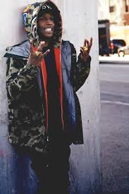
    A$AP Rocky is a key face in rap iconology and seen here wearing a BAPE hoodie like Ty’s.

  • The facial expression is fearless, “look at me”, the clenching of his teeth portrays he is confident and not modest about the way he looks. Hip hop has always been about showing off what you have and so I thought the image portrayed on the cover is essential, as it would give an insight to Ty but is also representing Hip-Hop as a genre. this is how Ty has been represented – young, cocky and volatile.

    Screen Shot 2017-05-02 at 12.55.23

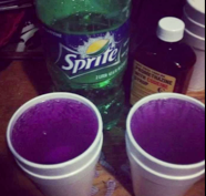
  • The purple hoodie and purple theme fits perfectly with the genre as a codeine and promethazine solution, more commonly known as ‘dirty Sprite’ or ‘purple Sprite’ [recreational drug frequently seen in rap & Hip-Hop culture], is a purple solution and  a sociolect of the culture and heavily associated with celebrities of this genre – such as FUTURE releasing his album DS2 [Dirty Sprite 2]. This portrays that Ty is fully involved in the rap culture, and acts as a better and more conventional face for the image my magazine is trying to create.
Unknown

FUTURE’s album DS2


Screen shot 2016-02-29 at 12.51.36

The ‘dirty sprite’ solution, a mix of codeine with promethazine giving off a purple colour.

My magazine is Hip-Hop/Rap. Most of the people in my magazine are stereotypical examples of what you’d expect to se in this genre – black/mixed race and young males between the ages 16-24. There are females but mostly the females are portrayed more as objects or a sign of how respected you are. (the more women the more respected).


Evidently they are perceived to be involved with a lot of drugs which is true, popular drugs include: sizzurp/purple sprite (codeine) and cannabis. This genre is very much associated with showing off what you have (e.g. the amount of women you can get) or showing off how expensive your clothes are e.g. expensive sneakers, jackets and excessive jewellery such as gold chains or grills. So I have made sure I have represented the people in my magazine as rich and fashionable, keeping with brands such as Bape.

Screen shot 2016-02-29 at 12.52.09

  • Rappers are also very respectful of themselves; figures such as Drake, Big Sean, Kanye West are all very conscious of where they come from, portraying despite their lifestyles the Hip-Hop culture has important morals and values and makes sure their audiences know that.
  • The language they use and communication with audiences is through visuals in the music videos, and hang signs. They are unique from other genres in the way that hey use a variety of sociolects – such as “sizzurp” or “dirty/purple Sprite” (codeine mixture), “finna” (going to), just to name a few.

Screen shot 2016-02-29 at 12.51.36

Lesson 1

Captain America: Civil War

The Forest (2015)

  • The target audience for Captain America would be families or younger/middle aged males. Whereas The Forest’s target audience is most likely to be adolescents or young adults.
  • The film with the largest budget is Captain America, this is because of the special effects needed in order to make the movie is very expensive, and also the cast are very top Hollywood stars and so it will cost a lot to pay them.

Article Page Planning.

1. Decide upon your style of article; interview Q&A or feature/ review / biographic feature/ opinion piece?

I will be using a Q&A interview for my article.

2. Look at some existing examples in that particular style; what are the key features? how could you adopt/develop these features and conventions in your work.

A few conventional things I’ve found in existing examples is that if it’s a biographical piece then there tends to be a large photo on one side and a block of text on the other. Whereas with interviews there are a lot of columns with sub-headings which are usually the questions asked in the intreview.

article-page-new

3. Get it in context! You’ve already designed a cover and a contents page; how does your article follow on from these?

  • My article will relate to my cover star and will be easily identifiable as it will be from the same shoot as the cover.
  • My contents page also has a featured image of my artist [Ty] on the right and so my article page follows cohesively from both my front cover and contents pages.

4. How will the article fit into your magazine?  Think about the house style – colour, fonts, layouts / audience – mode of address?

  • House style will stay the same, black, red and white as this is the brand logo’s house style, and so this generates a typical brand image and associated with those three colours.
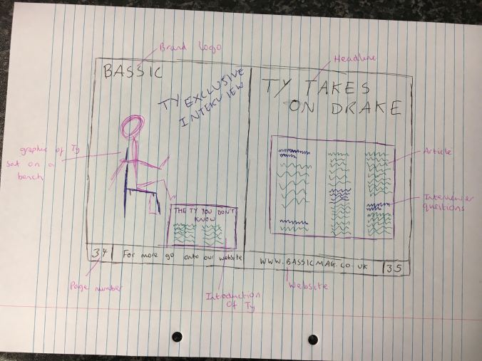
  • The layout will be split over 2 pages as so; an introduction and image of Ty on the left page, and the full article on the right. The introduction to Ty is not e necessity but as Ty is a breakthrough artist I feel as though it gives the readers information about someone new in the industry, and shows my magazines gives great attention to detail.

5. What will your angle be?  Why have you featured this particular artist or band? Is there a bias or point of view to the article?

  • My angle will be dead on and a transcript from my artist himself. This is because ra culture is very competitive and so anything my artist says needs to be recorded word for word to prevent my magazine being seen in the same light as ‘tabloid’ newspapers which twist words to make stories.

6. Think about your headline. What does it need to do? What will it tell the reader?

  • My headline needs to excite readers and grip them in, it needs to hype up the rap game as this is healthy for the industry.

7. Think about the quotes you will use? Why these particular words and what effect will the have on the readers interpretation of the interview?

  • “I”ll fight my way to the top” is a quote I will use as it’s passive aggressive, it can b interpreted as a lunge for someone but at the same time just motivational for one’s own self esteem.

8. Images – think about the photography you will need for the article – style/number of images/ colours/ locations/ angles/models required?

  • I want there to be a graphic image on my article page as this adds another dimension to my magazine, not just standard images.

9. Devise your layout on paper. Sketch out alternatives.

unnamed